
How I am Revising My Curriculum Based on E-Learning Instructional Design Principles
By Shannon Donnally Quinn, Michigan State University

DOI: https://www.doi.org/10.69732/VJLJ2909
While working on my PhD in Russian literature, my career took a turn toward instructional technology and curriculum development. After finishing graduate school I wanted a way to continue learning more in the field that was becoming my main field of interest, so I enrolled in a Master’s program in Instructional Design at the University of Massachusetts-Boston. I learned a lot of valuable concepts and honed some skills, and much of it I have internalized and use daily, but recently I wanted to return to two of the books that I found most useful in my Instructional Design study and revisit how they might help me to continue to improve the curriculum that I have designed.
The two books, e-Learning and the Science of Instruction by Ruth Colvin Clark and Richard E. Mayer, and Graphics for Learning by Ruth Colvin Clark and Chopeta Lyons, are predominantly focused on corporate training materials, but hold lessons for those of us in education as well, and online/hybrid courses are one place of a great deal of overlap in these two fields. The books summarize what we know from research about curriculum design and its effect on learning, especially in online environments. Many of the conclusions of the authors are reflected in common practice in curriculum design, but there are some findings that present more of a challenge. While most of my design decisions over the years have followed the contours of what is known about research in this area, there are some ways that I will be gradually working to improve my materials based on some of these principles. In this article I will summarize some of those principles and their effect on my thinking and how I plan to implement them in the future.
The Multimedia Principle
The gist of the Multimedia Principle is that, in general, learning is enhanced when materials include both words and visuals. I think most of us who design curriculum know this intuitively, and one big advantage of online materials is that including images (especially colorful ones) is much easier than it was in the past when our materials were for the most part on paper. Of course, we need to make sure that the images that we use are free to use as well as accessible for individuals who may not be able to benefit from the visual elements (there are lots of tips in my article about finding and creating visuals about some of these topics). One important finding of the research on e-learning is that graphics are more important for novice learners. So, while we want to include graphics that support learning for all of our students, they are especially important for beginners.
The Contiguity Principle
The Contiguity Principle holds that things that are related should be next to each other — text and graphics that go together should not be separated from each other, and feedback should be on the same screen as the questions and answers that it corresponds to. This seems to make common sense, but it is a principle that can sometimes get overlooked in materials development. Sometimes the interface of our learning management systems does not allow this — I have long been unhappy with the fact that our learning management system’s quizzing system often separates feedback from the related questions on a quiz.
Here I have included two visuals that were created with the Contiguity Principle in mind. The first has a map that shows where various ethnic groups tend to live within Russia. Having the words appear directly on the map is a better choice than if the map had colored regions and a legend below.

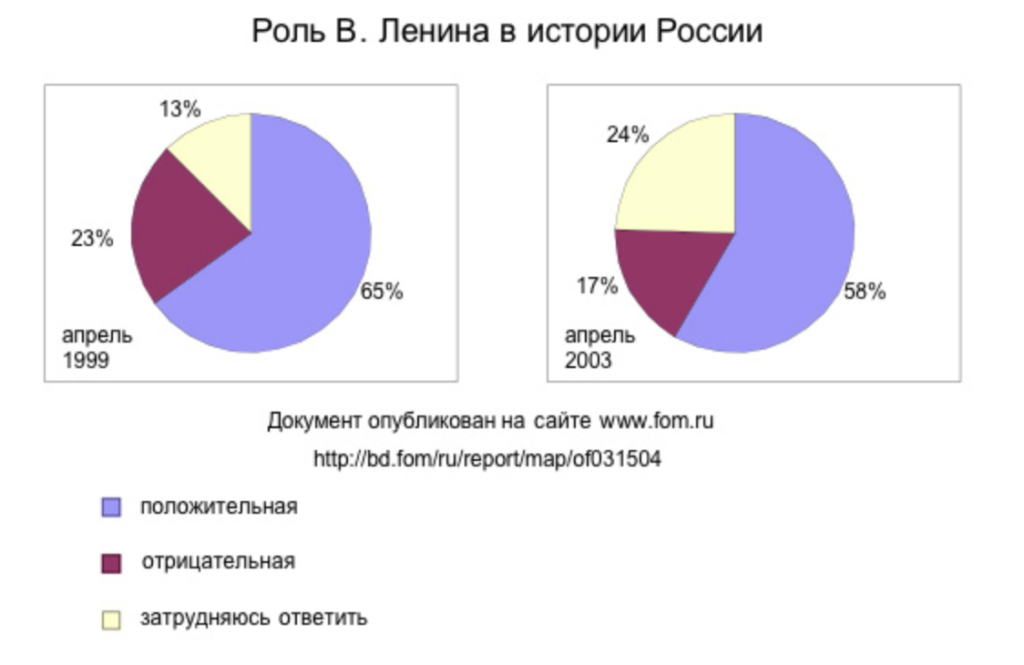
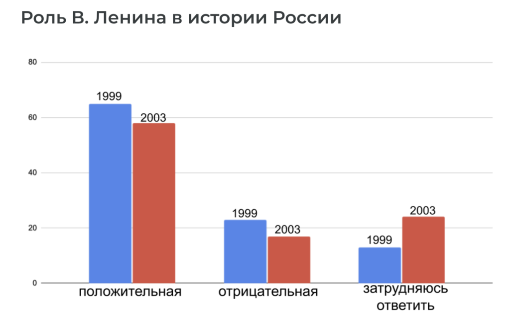
The next chart also adheres to the contiguity principle — this chart shows the results of a survey about the role of Lenin in the history of Russia. In the old version, I used pie charts and a legend. To improve the chart, I used a bar chart, where results are easier to compare, and put the information right next to the bars rather than in a legend on a different part of the page.
|
|
|
The Modality Principle
The Modality Principle is an interesting idea to ponder in the context of language teaching. It proposes that in general audio should not repeat the text on the screen, and that it is better to have audio only. The thinking behind this is that having both can split the learner’s attention. The authors do mention non-native speakers as one possible exception to this principle, and some of the studies in our field that show that subtitles and captions can be helpful to language learning may underscore that this principle may not apply to our field as much as to some other fields, when monolinguals may be the primary audience (see Gass, Winke, Isbell, & Ahn 2019).
There are several other exceptions to this principle that may be helpful to us as curriculum designers. Certain parts of lessons that need to remain to assist with working memory, like instructions, should stay on the screen, and it has been shown that key words can sometimes be helpful for learning. Giving students tools but also allowing them to choose whether they need them or not is also a way to implement a compromise that keeps the Modality Principle in mind.
The Coherence Principle
The Coherence Principle is one that I need to think more about as I continue to improve my curriculum. The idea behind the Coherence Principle is that adding elements to the lesson that serve purely to promote interest generally detract from learning. This includes decorative graphics, extra audio like music, and “seductive details” that are added just for interest. I admit, I have some difficulty with this principle. I often add things to my lessons that are not directly related to the lesson objective, but are meant to spark learners’ interest in Russian generally. This probably has something to do with whether we look at the short-term learning objectives or the larger outcomes, and some of the threads that we weave into our curriculum may only resurface for the learners weeks or years later. The book’s authors admit that they know much less about the Coherence Principle in terms of long-term motivation and learning. Interestingly, their research found that details added for interest were more likely to help “low-interest” learners (those not very intrinsically interested in the subject matter) but were very likely to impede learning in “high-interest” learners.
Because I want to look at the broader view of outcomes, I will probably continue sometimes to include interesting details that are not directly related to the immediate learning objectives, but I will keep the Coherence Principle in mind as I design. One thing that I may incorporate more often is the sharing of “seductive details” through buttons that do not interrupt the flow of the lesson but allow those who want to learn more the opportunity to do so, like in Picture 4, which is a photograph of the well-known Bolshoi Theater in Moscow.
One part of the Coherence Principle that makes a lot of sense to me is that, wherever possible, it is helpful to use simpler visuals like line drawings rather than photographs. Simpler visuals (like in Picture 5), as well as a consistent look and feel to graphics both help to reduce mental load for our students. Of course, when we want to introduce something that is culturally-specific, sometimes photographs are necessary and desirable (like in Picture 4). In the case of the Bolshoi Theater, I chose to include it because it is a culturally-relevant landmark that students will need to recognize as they learn more about Russian culture, and some of them may already recognize it or its name. This can also help to connect the words that they are learning to real life.
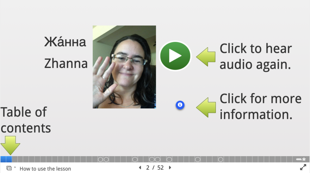
The Personalization Principle
Research on the Personalization Principle showed that a conversational rather than a formal tone leads to greater learning, as well as a sense of social presence and a visible author in the lessons. Interestingly, the use of “pedagogical agents” (some kind of character that helps the learner through the materials) also was shown to be positive for learning. Human voices were better than machine-like voices, and the voice of the author or pedagogical agent was more important than the visual, but the agent did not have to be human to be effective (though it needed to have human-like behavior). Because my students know me and know that I am the one leading them through the materials, I have only inserted myself occasionally as the author of my lessons. When I developed a set of alphabet lessons that were intended for use outside of my university, I did introduce myself as part of the lessons. Since all of my materials are sometimes used by other students, I will consider including more of an author presence in materials that I create in the future. This principle also has some potential connections with the concept of social presence in the community of inquiry model, as well as language instruction that focuses on everyday language or interpersonal communication.
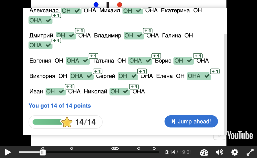
Practice and Feedback
Several of the authors’ points about practice will be helpful for me to keep in mind as I revise and improve my curriculum. Ideally, practice should be distributed throughout the learning activities, rather than concentrated at the end of a section. The amount of practice should be determined based on both how critical a particular task is, as well as whether it needs to become automatic. Practice spaced out (sometimes known as “spaced repetition”) is helpful, so cycling back to older material is something that we should not neglect. Another interesting point for me is that “over-learning” (continuing to practice even after something is mastered) is generally not hurtful, but it has diminishing returns, and therefore wastes time that could be spent elsewhere, not to mention the potential to bore the learner. This seems to me to be an argument for incorporating more adaptive learning, which is something that I have dabbled with but have not yet invested in fully. For example, in one activity in a lesson that teaches students about Russian names, I give students a list of Russian names and they have to determine to which gender each name traditionally belongs. If students get all of them right, they can skip ahead in the activity. This allows students who need it to get more practice, but those who have already learned it to avoid the diminishing returns of “over-learning”.
In accordance with the Contiguity Principle, feedback on practice activities should be given in close proximity with the questions and answers that it flows from. Explanatory feedback contributes to learning much more than corrective feedback, and feedback should focus on the task rather than the learner (even praise can sometimes depress learning). This gives further motivation for me to continue to work on improving the explanatory and targeted feedback in many of my materials. It is a time-consuming process, but Clark and Mayer show that it is worth the time invested since this explanatory feedback improves learning.
Graphics
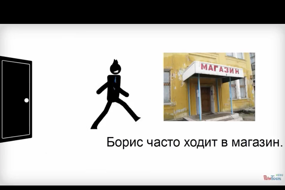
While graphics are usually more time-consuming and expensive to produce than text, research clearly shows that including them helps bolster learning. Luckily, in many cases, simpler images are more effective than more complicated ones, and in many cases still images are just as good or better than animations or videos. Animations or videos can be more effective for topics that concern motion (I would propose, for example, that simple animations help with topics such as verbs of motion in Russian (like in Picture 8), and for scenarios that are intended to be realistic (like in Picture 9). If animation is included, it is important to include learner control (pause or replay buttons, for example).
In the future I will prioritize animation for topics that include motion and conserve time by using still images for most other topics since they have been shown to be just as or even more effective. While normally simpler images are better, I will use more realistic graphics for scenarios that demand a sense of realism as learners imagine themselves in the situation, which is also a good opportunity to include culturally-authentic realia in the course materials. And in general, this may be another moment when our goals as language teachers diverge slightly from typical e-learning materials that assume monolingual learners. When culturally-authentic photographs can help students orient to important details from the target culture or spark deeper interest in the target language or culture, they are certainly worth the additional cognitive load that they may represent. In part, we will just want to keep our goals in mind and make sure we give students the scaffolding and time that they need if they need extra help to interpret these images that may represent a different reality from what they expect.

Conclusion
The set of principles discussed above is just a subset of the principles laid out in the books, which you may want to explore to find further connections for language teaching. Keeping these principles in mind will help you to take advantage of research-supported benefits and make the text, graphics, audio, and video components of your materials more purposeful and effective. There is a lot that we can learn from the field of corporate e-learning, and if we have these principles in mind from the beginning, our curriculum can take advantage of some of the research done in this field. Luckily, there are also ways that we can continue to improve our materials even after they are created.
References
Clark, R. C., & Mayer, R. E. (2011). E-learning and the science of instruction: Proven guidelines for consumers and designers of multimedia learning. John Wiley & Sons.
Clark, R. C., & Lyons, C. (2010). Graphics for learning: Proven guidelines for planning, designing, and evaluating visuals in training materials. John Wiley & Sons.
Gass, S., Winke, P., Isbell, D. R., & Ahn, J. (2019). How captions help people learn languages: A working-memory, eye-tracking study. Language Learning & Technology, 23(2), 84–104. https://doi.org/10125/44684
Thanks for such a thoughtful and well-organized presentation, Shannon! I applaud your willingness to keep trying to understand and practice a principle-driven approach to your materials. I particularly appreciate that your take on “personalization” which reminds us that interaction between learner and instructor (both of us being present) is just as important as the algorithmic presentation and ordering of material.
What a good point about personalization, Jeff! Thanks for continuing the conversation.