Thinking Outside the Box: Creating An Interactive Infographic for World Language Professional Development Using H5P
By Amber Hoye, Boise State University

DOI: https://www.doi.org/10.69732/KGEP4576
Introduction
Many of us stick to familiar tools and routines when making instructional materials. We often use tools like slide decks for presentations and word documents for worksheets, just as they’re intended. But what happens if we break from this pattern and try using these tools differently? For instance, have you ever experimented with making a “choose your own adventure” story or a drag-and-drop activity using Google Slides? In this article, I’ll discuss how I used this “out of the box” thinking to create an interactive infographic for incorporating authentic materials into the world language classroom.
Last fall, I was working on a book titled “Find, Customize, and Share: A Second Language Teacher’s Guide to Utilizing 900+ Open Activities in Your PreK-16 Classroom.” I needed to explain the importance of integrating authentic materials into language curriculum in a way that would excite, but not overwhelm, instructors who often struggle with time constraints and encounter similar difficulties to their students when it comes to finding and using digital resources effectively. I knew from working with K-12 instructors in our research cohorts that they needed help learning how to source and incorporate authentic materials, especially for novice learners. Many instructors also grappled with the fear of overwhelming their students and described past frustrations navigating through websites without being able to find their desired material. How could I make a tool to assist teachers understand this complex topic?

Based on my experience working with the language instructors, I envisioned an infographic that would assist them in understanding the different types of authentic materials available, provide search terms and descriptions for each type, and several authentic examples. I had selected Pressbooks, a user-friendly publishing platform, to publish the book and knew that using H5P to create interactive material for this section could be beneficial. H5P provides templates to create interactive activities without the need for coding knowledge and can be added to Pressbooks or saved as a SCORM package and uploaded to a learning management system. Both free and paid versions of H5P exist, with a free version included in some account types in Pressbooks.
To begin, I tried out H5P’s image hotspot and course presentation tools to see if I could create an infographic. Below, you’ll see examples of the mockups I created in both tools:
1. Image Hotspot: In the top screenshot, the plus indicates to the user that there is an interactive item. The bottom screenshot shows the information that appears once the user clicks on the plus sign. While this accomplished the task of scaffolding the information, visually it felt like there was a lot going on with the plus signs and then having to scroll through the text once clicked on.
2. Course Presentation: With this tool, I was able to create a slide for each authentic material and since it focused on just one tool at a time, the information felt less overwhelming. However, there wasn’t any easy way to navigate to different artifacts like I was envisioning.
Ultimately, I decided to try out a new way to use the H5P column content type (a tool that can combine almost any of the H5P content types, including course presentations), which I learned from David Lohner, a scientific assistant for the Karlsruhe Institute of Technology. Using this content type, I could create an interactive presentation with several sections in order to accommodate a long form infographic.
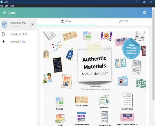
Try Out the Completed Infographic
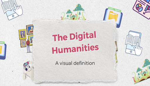
You can explore the finished interactive infographic, which is embedded in the page below, by clicking on the icons (“Comics”, “Transit Tickets”, etc.). On our institution’s Pressbooks site, you can also discover additional H5P Activities, including an additional infographic on the Digital Humanities: https://boisestate.pressbooks.pub/pathwaysguide/chapter/authentic-materials-and-digital-humanities-sites/
Designing the Infographic
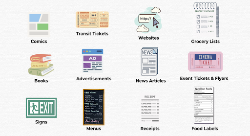
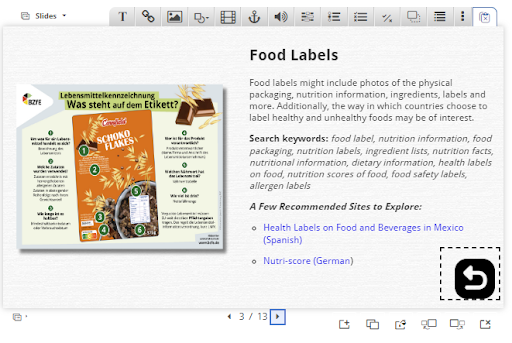
When creating H5P activities, I like to use a free tool called Lumi, which allows you to preview the activity you are creating at any time (whereas using the H5P tool in Pressbooks directly requires a save each time you want to preview). Being able to toggle between the workspace and preview is helpful and time efficient. To begin, I created an outline of the artifacts I wanted to include and wrote up the accompanying text description for each one. Here are a few examples of the authentic artifacts I selected to include:
My goal was to provide a consistent experience for users, so I used a similar format for each artifact and as a result most of them have the following: a description of the artifact type, search keywords to help instructors find this type of material, and a few recommended sites to explore. While I am a Spanish speaker and have a large list of sites for the language, I wanted to challenge myself to put these search keywords to use and find a wide variety of sites for different languages. This helped me to try out the process as though I was an instructor of these languages and make sure the search terms were effective.
Once the example artifacts were identified and the descriptions were written out, I began the process of outlining the design. I knew that using icons might be a nice way to provide some visual interest and uniformity, especially with some of these categories being large and perhaps challenging to represent with a photo. The icons would also provide a consistent look and feel, which would help provide a good user experience. Canva has an extensive collection of icons and is also a great tool for graphic design, so I decided to start building the infographic there. One important thing to know about the column type in H5P is that you are stacking different tools on top of each other to form an activity. There might be a course presentation paired with a drag and drop activity or an interactive video followed by a questionnaire. For this infographic, I elected to use only the course presentation tool because it allows for a button to be created to send the user to another slide or page. This also allows the creator to build many hidden pages that are only visible once the button is clicked, which is a nice way to scaffold so much information. I decided to create three course presentations, or panels, and began laying out the design.
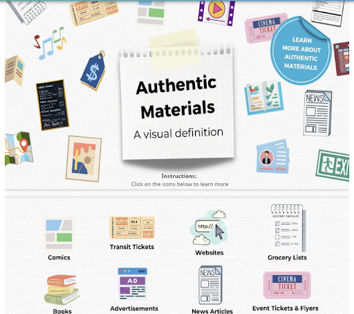
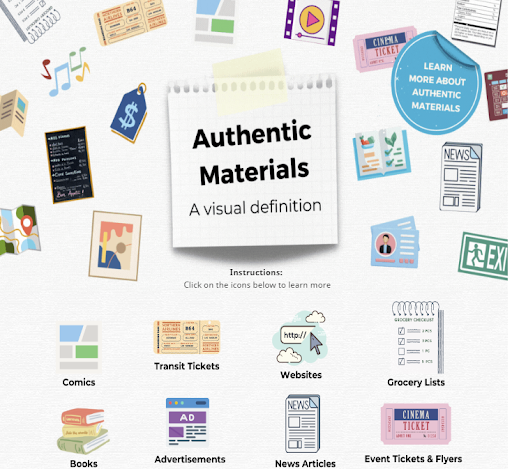
Panels 2 & 3:
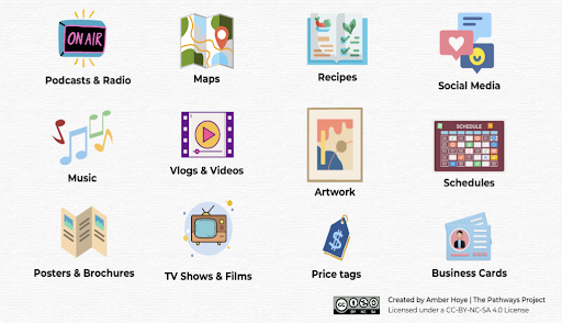
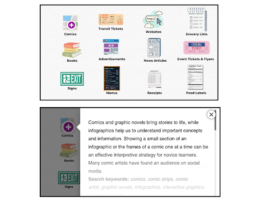
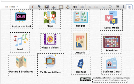
I started with these two panels and identified a visual icon to represent each category. I included the label for each one on the Canva document, knowing that once a button was created, I could give each button a title in H5P for accessibility purposes. I then laid each icon out into a grid and saved the panels as two separate graphics.
At the bottom of panel number three, I created a licensing section that includes a button to learn more about the assets. This would lead to the panel below:
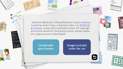
Panel 1:
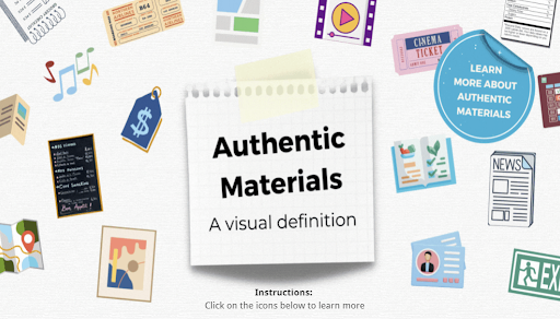
Finally, in this panel, I decided to create the header for the infographic and instructions for how to access the different descriptions. I also wanted to provide a resource for instructors who wanted to learn more about authentic materials, but didn’t want the text to take away from the visual design. To do this, I created a “Learn More about Authentic Materials” sticker that would lead users to a slide with a definition and link to an ACTFL web page for more information. The use of stickers like this are a nice way to provide just in time information for those who need it. To provide a visual flow between the header and the rest of the infographic, I incorporated the authentic material icons into a playful design and then saved this panel as its own graphic.
Building the Infographic Using the H5P Column Tool in Lumi
Using the Lumi app for H5P, I created a column activity comprising three parts, each utilizing the “Course Presentation” content type. This content type is similar to a slide deck, with the option to add buttons, media, and activities. It is typically accessed in a linear fashion, like a slideshow. In this case however, I wanted to make it so that the icons served as buttons directing the user to another page, with the option to go back to the main page from any screen. The key to creating this seamless experience between the panels is selecting the following behavior settings:
- Check Activate Surface Mode, which will disable the navigation arrows at the button of the screen. This will make it so that the only way to view the additional slides you’ve created is by clicking on the buttons.
- Uncheck Summary Slide, this slide is not needed unless you’re adding activities and would like the user to be able to review their score at the end.
- Under Separate Content with a Horizontal Ruler, select “Never use ruler above”, which will eliminate the lines and spacing between each presentation, making them appear as one.
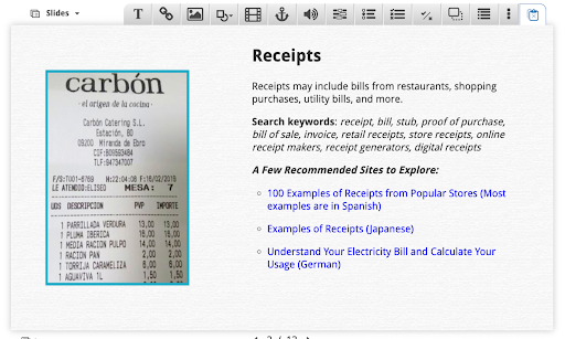
Once the course presentations were created, I used the “add new slide” button to add a slide for each artifact description. I was able to enter the text here directly, which makes the infographic more accessible than static text. I then added a back button icon in the bottom corner and used the “go to slide” option to create an overlay so that clicking on the icon would take users back to the home page, or specific slide number #1. You can choose to make these buttons invisible, but I left this unchecked so that it was obvious that it was a button when you mouse over it.
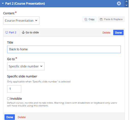
I repeated these steps for each artifact description, then completed a similar process to add a go to slide button for each icon on the home page.
H5P held its inaugural Academy Awards on February 28, 2024, celebrating interactive activities crafted by instructional designers, instructors, technologists, and creatives worldwide. The event showcased five award categories and I’m thrilled to share that this infographic won the award for “Outstanding Visual Design”.
If you’re using H5P or interested in seeing more examples for the world language classroom, check out the “100 Creative ideas to use H5P in Language Teaching” project from Dominique Scheffel-Dunand (York University, Canada) and Sushumna Tadinada Rao. The pair is currently crowdsourcing ideas and this collection will be hosted on the Camerise site and will be made available under the Creative Commons License CC-BY-NC-SA.
To conclude, I hit a roadblock with conventional tools when trying to bring my design of an authentic materials infographic to life. Instead of settling, I dove into exploring different ways to maximize the potential of tools like the column tool in H5P. Through trial and error, I discovered fresh ways to utilize features like the course presentation tool in new ways. By thinking creatively, I turned static content into an engaging tool for language educators. I encourage you to embrace experimentation and creativity in the tools you regularly work with—you never know what innovative solutions you might discover!
Just curious about accessibility for students with sight issues. Are these infographics screen reader friendly? Can all the parts have alt tag descriptions?
Hi Nik,
Great question! I was able to add alt text to all the buttons. I consider the images within each slide to be decorative so I embedded them in the background, as they are not necessary to understand the content and are examples that are also linked on the pages. If you were to add the photos directly in H5P, there is an option to add alt text. Here’s a link to learn more about H5P’s accessibility features: https://help.h5p.com/hc/en-us/articles/7505649072797-Content-types-recommendations
hi, are you really Mr peachy on telegram’s AI forum or another one?