
5 Takeaways from “Slide:ology: The Art and Science of Creating Great Presentations”
By Shannon Donnally Quinn, Michigan State University

DOI: https://www.doi.org/10.69732/TTMG9189
This short article is part of our new series, “5 Takeaways”, where authors share their reactions to a book or other media by highlighting five key points – big or small – that they found most interesting or useful. The featured work may come from within the language teaching field, but it also may be from outside it.
If you are a graduate student reading books, listening to podcasts, or watching videos for your coursework, a “5 Takeaways” piece can help you distill the main ideas (or, for a more in-depth evaluation, you could write a book review). If you are involved in teacher training, consider assigning “5 Takeaways” pieces to give your students publication experience while they complete their coursework. And if you are a professional in the field, use this opportunity as motivation to finally read that book on your shelf – and to learn from the insights others are discovering.
To find out more about this article type, see the authors guidelines for 5 Takeaways.
Introduction
This article gives 5 takeaways from the 2008 book Slide:ology by Nancy Duarte. The book is about how to design better presentation slides (such as PowerPoint) and is mainly aimed at people who have to give corporate presentations. It includes some interesting case studies of leaders of companies or organizations who have effective presentation styles. Since slide presentations are often used in teaching, the book has some insights that are relevant to language teachers, though some of the insights may be helpful more for literature or content classes than for language courses. Some of the points in the book may also be useful for other types of teaching materials, even beyond slides.
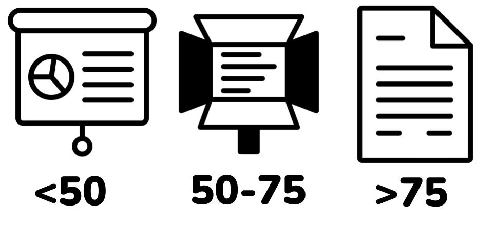
Takeaway 1: If a slide has more than 75 words, it should be a document.
Duarte’s point of view is that there should be as few words on the screen as possible, and there should just be the minimum number of words to encapsulate the point. She says that if a slide has around 50 words, it really is functioning as a teleprompter, and recommends cutting down further. In her view, bullet points should be like headlines, with the presenter filling out the details in the spoken part of the presentation. This helps the audience to be listening, rather than being distracted by reading. And of course we want our students to be listening to the target language input that we are providing for them!

Use at least a 30 point font on your slides. This isn’t just easier to read, it also forces you to be concise and focus on the most important points.
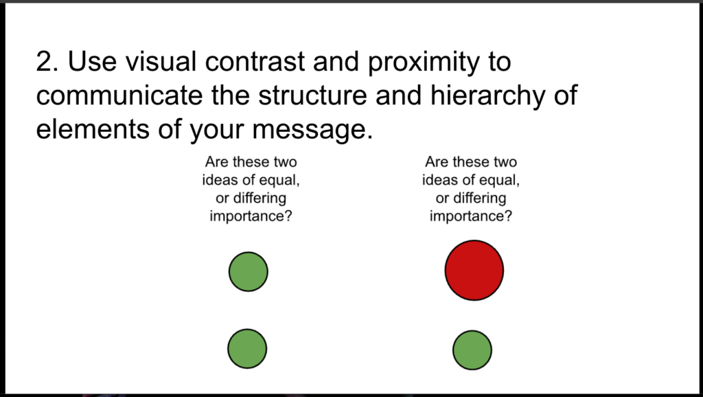
Takeaway 2: Use visual contrast and proximity to communicate the structure and hierarchy of elements of your message.
The way that elements are positioned on your slides communicates a message, and so you want that message to be intentional. The relationship between ideas comes through contrast, and contrast can be communicated in a number of ways, including size, shape, shade, color, and proximity. Make sure that if you have two ideas on your slide that are of equal importance, or of differing importance, that the visual elements of those ideas communicate that correctly.
An important point that the book does not spend much time on is that we should do our best to ensure that the information that is communicated through visual means is accessible to all through alt text or in another way.
Takeaway 3: Whenever possible, replace words on slides with pictures.
Though as language teachers we of course often focus on words, from research we know that including both words and pictures helps with learning, especially for novice learners (this is called “the Multimedia Principle” in instructional design). And with many sites like Pixabay and Wikimedia Commons available, which offer copyright-free or Creative Commons images, it is easier than ever to include many visuals in our learning materials (learn more about finding and creating visuals for your curriculum or about instructional design principles).
Duarte also suggests constructing a library of images that can be reused in a variety of presentations. Language teachers may find this useful as well. I know that at times I have found myself searching for similar images over and over again. One simple way that I have found that helps is that I have a folder on my computer’s desktop that I call “often used things” that includes images that I reuse. If you have suggestions for how you have been able to curate images for use in your teaching materials, we would love to hear from you in the comments!

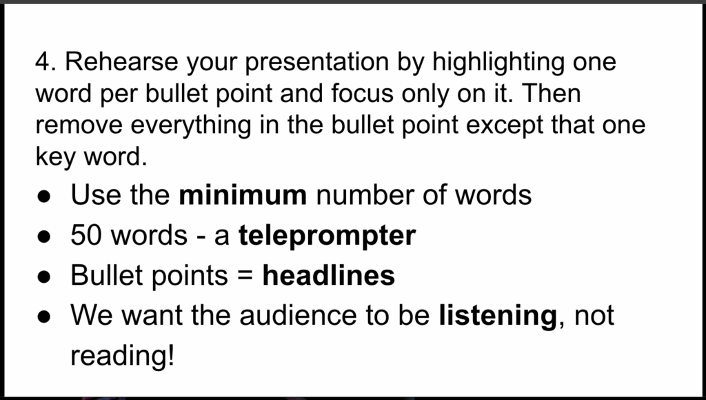
Takeaway 4: Rehearse your presentation by highlighting one word per bullet point and focus only on it. Then remove everything in the bullet point except that one key word.
Duarte believes that most people do not dedicate enough time to rehearsal before a presentation, which leads to their overreliance on having many words on the screen. She recommends rehearsing using the method above as well as recording yourself as you rehearse to help you identify where you can cut down the number of words on the screen. Language teachers may not have the time to rehearse every aspect of their classes beforehand, but it is certainly a good idea to keep these guidelines in mind to help us focus on the most important points. We can also use these ideas to help our students rehearse when they may be engaging in the presentational mode. Hopefully this encourages them to become increasingly comfortable with spontaneous communication, even as they rely on key words and rehearsal.
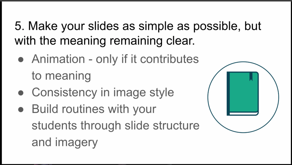
Takeaway 5: Make your slides as simple as possible, but with the meaning remaining clear.
While sometimes complexity can be important, whatever your main point is should stand out on your slides. Duarte gives examples from charts and graphs, demonstrating the point that the most relevant information should be highlighted so it is easy for learners to identify. An example from language teaching could be that if you are asking your students to focus on a particular grammatical form, you may want to highlight that form with some kind of contrast. While this point seems obvious, it is always a good idea to come at your course materials with fresh eyes and assess whether the main point that you would like your students to get from them clearly stands out from the rest of the information on the slide. At the same time, don’t forget that visuals on slides can sometimes not be accessible. Not all students can see colors, so make sure that anything that is communicated using colors is duplicated using another method. Don’t forget to put in alt text for images, and include all of the information that is relevant for learning in those tags.
On a related note, dispense with unnecessary complexity. Include animation only if it contributes to the meaning of the slide, and build up routines with your students using simple, familiar cues in slides. For example, if your students are going to be doing a reading activity, include a representative image that you recycle, like the book in the slide below. This helps them to know immediately what you want them to do, lessening their cognitive load. These insights also are similar to those found in research on instructional design.
Conclusion
Slide:ology is a book that is worth reading, despite the fact that it is aimed at people who work in corporations rather than in education. It includes many interesting visual examples that help to get its points across, and all of us can continue to improve our presentation skills.
References
Duarte, N. (2008). Slide: ology: The art and science of creating great presentations. Sebastopol: O’Reilly Media.
It’s incredible how something as simple as presentation design can impact how we communicate our ideas. Thanks for highlighting those key takeaways—I’m definitely going to rethink my slides! Your insights are super helpful for anyone looking to up their presentation game!