
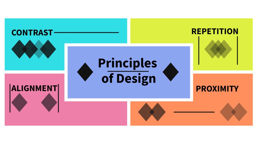
5 Takeaways from “The Non-Designer’s Design Book: Design and Typographic Principles for the Visual Novice” by Robin Williams
By Shannon Donnally Quinn, Michigan State University

DOI: https://www.doi.org/10.69732/HBFF9407
This short article is part of a new series called “5 Takeaways”, in which the author of the article gives their reaction to a book or other type of media with what the author deems to be the 5 most interesting or most useful points from the source that can relate to language learning, whether big or small.
Introduction
As its title suggests, The Non-Designer’s Design Book: Design and Typographic Principles for the Visual Novice by Robin Williams introduces fundamental principles of graphic design for readers who are not professional designers. At first glance, graphic design, which is the practice of communicating ideas through a combination of visual and textual elements, may not seem particularly relevant to language teachers, but this assumption overlooks several important points.
The role of teachers has expanded significantly in recent years, and we are now expected to take on tasks that clearly benefit from a knowledge of graphic design principles, such as creating event posters, developing informational graphics for administrators, advertising programs to prospective students, and perhaps most notably, materials design. Even if we do not always recognize it as such, graphic design has long been central to effective teaching. Beyond making materials visually appealing, one of the primary functions of graphic design is to organize information – an essential component of both good instruction and thoughtful curriculum design. Finally, as author Robin Williams argues, attractive design increases the likelihood that a message will be read, understood, and remembered.
Takeaway 1: One of the main functions of graphic design is to organize information.
While many of us associate graphic design primarily with advertising, it in fact shapes anything that includes text. For this reason, graphic design should also inform how we design our language curricula. This does not mean that we need to become expert graphic designers. Rather, learning a few basic principles can help us organize information more clearly and effectively for our learners. Many of these principles are ones we already use intuitively, but greater awareness allows us to recognize moments when organization could be improved and to consciously adopt strategies we notice in successful designs around us.
Another piece of good news is that the tools we commonly use, such as Canva, Genially, and Piktochart, often build solid graphic design principles directly into their templates, making it easier than ever to create organized and effective visuals. For example, the event template shown below, available in Piktochart, applies several key design principles (contrast, repetition, alignment, and proximity) in a way that allows viewers to quickly understand how many events are happening during the week at a glance.
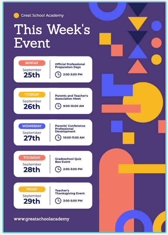
Understanding these graphic design principles will allow us to use these tools more effectively and bring our own ideas into the process as we react to the needs of our learners.
Takeaway 2: The four principles of graphic design are Contrast, Repetition, Alignment, and Proximity.
For more detailed explanations of each of these principles, along with many engaging examples, I recommend consulting Robin Williams’s book through your institution’s library. Below, however, I briefly outline each principle and describe how it relates to curriculum and instructional design, in my own words.
Contrast helps viewers perceive hierarchy. The structure of information should be reflected in the structure of the visual itself, and instructional design research consistently shows that helping learners recognize structure is essential for learning. Contrast allows designers to distinguish more important information from less important information, guiding learners’ attention accordingly. When we want our students to notice a particular form, for example, we might put it in bold to contrast it with the rest of the text in a sentence.
Repetition creates consistency, which in turn helps manage cognitive load. For example, using a consistent layout helps students spend less effort on figuring out the task and more effort on the language task itself. Consistent design also allows for occasional variation; when an unexpected element appears, it is more likely to capture learners’ attention, which can facilitate noticing. In this way, repetition supports learners’ understanding of both structure and relative importance.
Alignment ensures that every element in a design is positioned intentionally to support processing. When items appear scattered randomly across a page or screen, learners receive little guidance about what to focus on or in what order to process information. Thoughtful alignment helps guide the learner’s eye and reinforces the organization of the content.
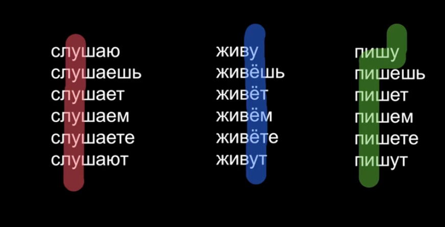
Proximity refers to grouping related items together to highlight relationships among pieces of information. When related elements are placed close to one another, they are perceived as a single unit, which often makes them easier to process. Conversely, unrelated items should be separated, and designers should not hesitate to use white space as a powerful organizing tool.
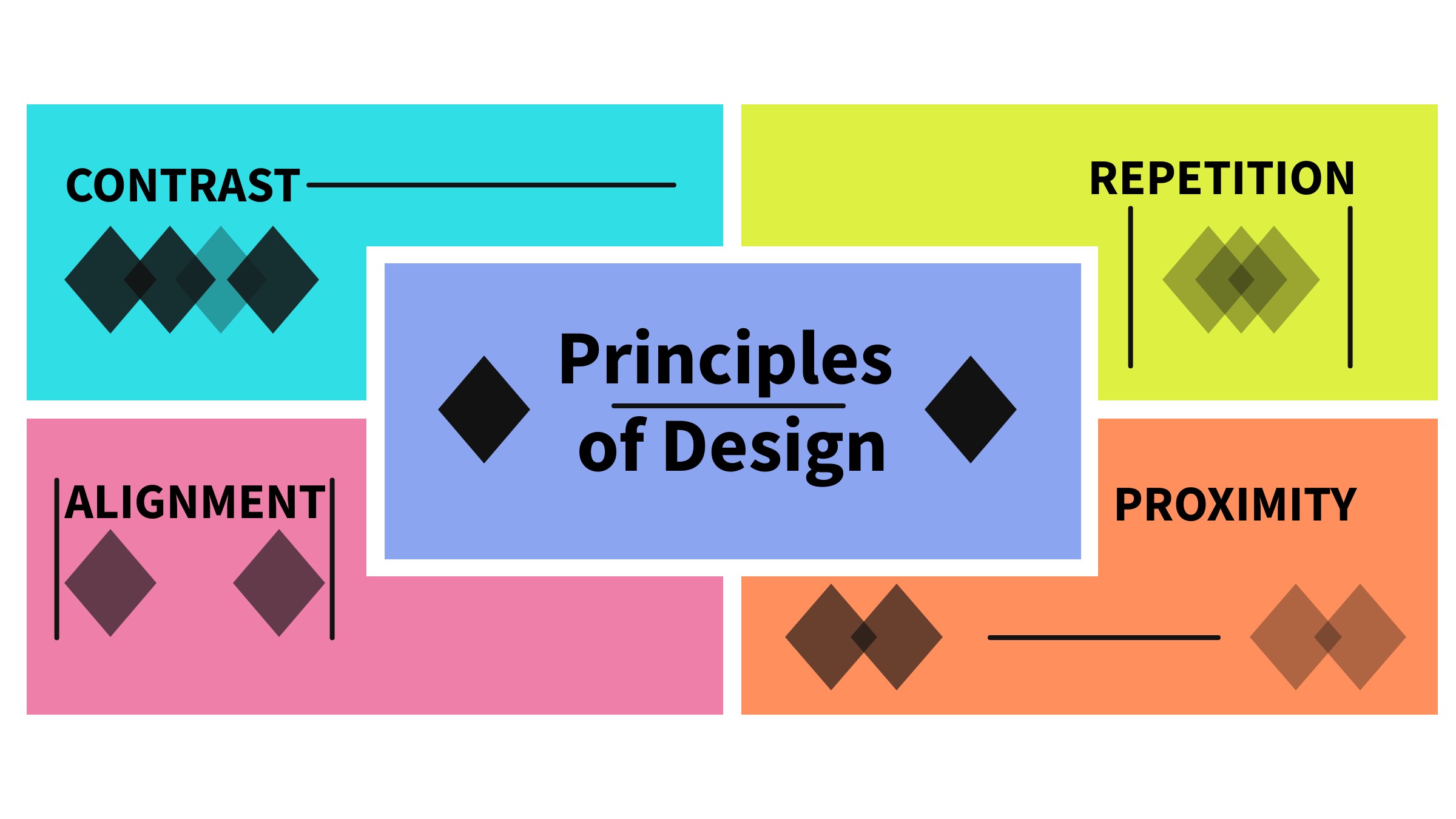
I used a Genially template to create the image below that summarizes the principles of design. I don’t claim it to be the best graphic design in the world, but I tried to use some of the principles outlined in the book. How would you create a similar graphic?
The design shown below introduces basic facts about the three largest cities in Uzbekistan and comes from a graphic I have been developing for my online OER textbook Diverse Russian: A Multicultural Exploration. The design is adapted from a template in Genially. Although relatively simple, it illustrates several of the principles discussed above. Can you identify them?
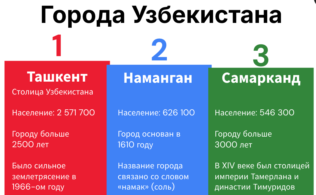
Contrast. The design uses the colors of the Uzbek flag, along with the varying heights of the numbers, to communicate the relative size of the cities. In addition, the contrast between bolded, slightly larger text and the smaller text below makes it easy for learners to identify the most important information – the city names.
Repetition. The repeated block format signals that each box represents a different city. The internal structure of the information is also repeated, creating consistency that makes the graphic easier to process.
Alignment and Proximity. Within each box, related elements are both aligned and placed in close proximity. Once learners recognize that one line in each box corresponds to “Population” (Население), they can quickly locate and compare that information across cities because it appears in the same aligned position in each block.
Takeaway 3: Going outside of guidelines can be effective when it’s purposeful.
Much like the familiar adage that one must first learn the rules before breaking them, Williams offers several examples in which “breaking the rules” results in effective design.
The author generally advises beginning designers to avoid centering everything, since text that is flush left or right typically creates a stronger sense of alignment. That said, when there is a clear purpose, center alignment can be effective, particularly when a more formal or balanced tone is desired.
Consistent alignment is essential for creating a coherent design, but once that alignment has been established, deliberately placing an important element out of alignment can be a powerful way to draw the viewer’s attention and an additional tool to promote noticing.
Takeaway 4: Choose typefaces (fonts) intentionally.
There are six main categories of typefaces (or fonts): Oldstyle, Modern, Slab serif, Sans serif, Script, and Decorative. When combining fonts in a design, it is generally recommended to mix fonts from different categories; fonts from the same category tend to be too similar and do not create enough visual contrast.
Typefaces can add interest to a design, and contrasts between fonts help signal differences in importance and function within a visual. Below is a brief overview of the major font categories, along with examples shown in the accompanying image. Here I focus on Latin script (with an added Cyrillic challenge), but some of the same concepts can apply to other types of scripts.
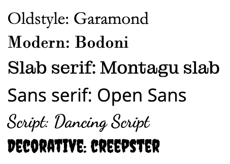
Oldstyle typefaces have angled serifs (the small “feet” at the ends of letters) and noticeable variation in stroke thickness, known as a thick/thin transition. Because of their high readability, Oldstyle fonts are often used for longer passages of text, so you might want to choose an Oldstyle typeface if you are having your students engage with a longer reading passage.
Modern typefaces feature horizontal serifs and usually a dramatic thick/thin transition. Serif fonts are thought to be easier to read on paper, so if you have handouts for your students, you may want to choose one of the serif font types (Oldstyle, Modern, or Slab).
Slab serif typefaces have thick, block-like serifs and little to no thick/thin transition. Their straightforward appearance makes them common in children’s books and instructional materials.
Sans serif typefaces lack serifs entirely and typically show little or no thick/thin transition. Sans serif fonts can sometimes be easier to read online, since pixels can make serifs fuzzy, so you may want to have the majority of the materials that your students will access online be written in a sans serif font.
Script typefaces imitate handwritten text. They should be used sparingly, never in all capital letters, and should not be combined with italics, as this reduces readability. However, if your students are learning a new handwritten script like Cyrillic and need practice with reading it, it might make sense to include some materials that use these kinds of fonts. You just also need to keep in mind that the learners may need more processing time than they would for a serif or sans serif font. Additionally, script fonts may add realism to particular tasks that in real life would use handwriting. If you have your students complete a task in which they have to read a handwritten note left for them by their host family on study abroad, for example, a script font would be appropriate.
Decorative typefaces are designed primarily for visual or emotional impact rather than readability. Because of this, they should be used very sparingly and only for short text elements, such as titles or accents. Some decorative fonts are not available in non-Latin scripts.
Now see whether you can tell the difference between these 6 types of fonts by taking this quiz. Drag the fonts on the right to the types of fonts on the left.
Give yourself an additional challenge! Can you identify which types these Russian fonts belong to? Drag the fonts on the right to the types of fonts on the left.
Another important consideration when designing materials for language classes is that languages with different writing systems often do not have the same range or categories of typefaces, or they may offer far fewer font options overall. In these cases, it becomes especially important to rely on underlying design principles (such as contrast) when deciding how to incorporate multiple fonts.
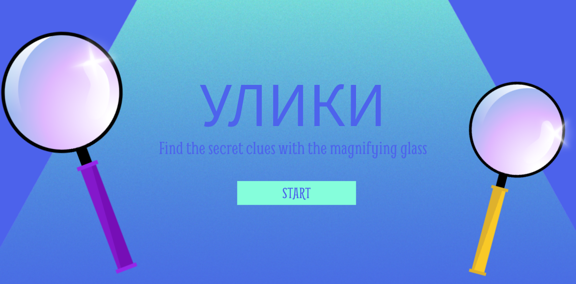
For example, when I design activities for my Russian classes in Genially, the templates often use a specific English-language font to evoke a particular context or atmosphere. However, when I switch the text to Russian, the platform frequently defaults to a generic sans serif font. In situations like this, designers need to think carefully about how to preserve contrast and visual hierarchy, even when typographic choices are limited. Similar impacts can be produced using elements other than the type (like color, images, or proximity), if that is indeed appropriate from the point of view of the target culture. Although attractive, well-organized materials help build learners’ trust, the real value of visual design lies in how it supports learning. Effective visual design can draw learners’ attention to language forms, improve comprehensibility, and increase engagement.
|
|
|

Takeaway 5: Promoting or avoiding concordance, contrast, or conflict in designs can help your materials have the intended effect on your learners.
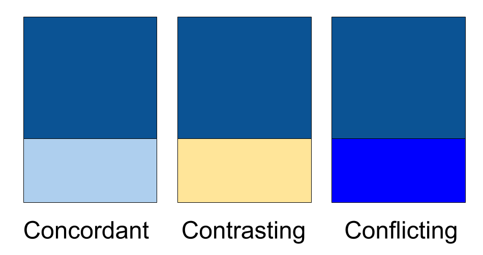
A design is concordant when the elements on the page share similar qualities. Concordant designs tend to feel calm, orderly, and formal. A design uses contrast when elements differ from one another; contrast naturally attracts the viewer’s eye and can be used intentionally to guide learners’ attention. This can be useful in assisting learners in noticing. A design is in conflict when elements are similar but not similar enough – close, but mismatched. Conflict creates visual tension and should generally be avoided.
These concepts apply to many aspects of design. One common example is mixing typefaces that are too similar, but the same principles also apply to color choices and graphics. The book provides detailed guidance on selecting colors that work together, either through concordance or contrast, without creating conflict. In the image below, the design on the left uses two similar blue tones, resulting in a concordant effect. In the middle, blue and yellow (complementary colors) create strong contrast. On the right, the two blues are too close in hue, producing visual conflict.
Once you are able to recognize concordance, contrast, and conflict in a design, you can apply these concepts more deliberately when creating materials for your learners. Concordance helps maintain consistency, contrast directs attention, and conflict can be consciously avoided to reduce visual confusion.
Color choice should be carefully considered, especially since contrast between adjacent colors is important for accessibility. Tools like accessibility color contrast checkers (the example that I link to here is called WebAIM Contrast Checker) should be employed to ensure maximum readability.
So-called warm colors (reds, yellows, oranges) come forward, whereas cool colors (greens, blues, purples) recede into the background. Consequently, you generally need to use more of a cool color to balance out a warm color.
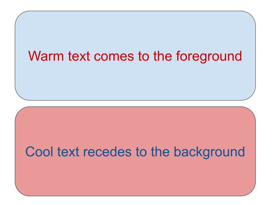
This trait of warm vs. cool colors can help to inform the color choices that you make in your curricular materials. If you want something to stand out to learners, you would want to choose warm tones. For example, if you had a warning for students that you want to make sure they notice, you may want to choose a warm tone like red. By contrast, you might want to rely more on cool colors for longer activities since cool tones allow more sustained engagement without visual fatigue.
Conclusion
The Non-Designer’s Design Book is a useful introduction to core principles of graphic design and can be especially helpful for educators seeking a foundation in this area. However, because the book is more than a decade old and focuses primarily on print-based design rather than digital media, it omits several considerations that are now essential. Most notably, it does not address accessibility, a critical component of contemporary learning design. It also does not discuss designing for mobile devices or varying screen sizes, an increasingly important concern given the widespread use of smartphones and tablets. Even so, the book remains a worthwhile read, particularly for increasing teachers’ awareness of the role that graphic design plays in our instructional work.
References
Williams, R. (2015). The non-designer’s design book: Design and typographic principles for the visual novice (4th ed.). San Francisco, California: Peachpit Press.
AI disclosure: AI was used to polish wording.
This is a valuable primer – thank you for sharing it!