5 Takeaways from Designing Accessible Learning Content by Susi Miller
By Shannon Donnally Quinn, Michigan State University

DOI: https://www.doi.org/10.69732/ETJO1569
This short article is part of a new series called “5 Takeaways”, in which the author of the article gives their reaction to a book or other type of media with what the author deems to be the 5 most interesting or most useful points from the source that can relate to language learning, whether big or small.
Please note that all links in this article open in a new tab.
Introduction
Designing Accessible Learning Content (2nd edition) by Susi Miller provides a thorough overview of accessibility standards relevant to eLearning from the perspective of an instructional designer. The first part of the book introduces key terminology, explains different types of disabilities and the assistive technologies that support people with access needs, and makes a compelling case for the importance of accessibility in learning design. The second part examines accessibility standards in depth through two organizational frameworks: the WCAG (Web Content Accessibility Guidelines) and the eLa (eLearning accessibility) framework. Because these frameworks largely address the same standards but organize them differently, readers may find that they do not need to read both sections of Part Two in full.
Takeaway 1: “Progress over perfection” – a mantra for all of us imperfectly implementing accessibility
Miller credits the accessibility advocate Meryl Evans with the phrase “progress over perfection,” which captures the important idea that it is far better to continue improving accessibility incrementally than to abandon the effort altogether. As I read the book, I admittedly found some of the accessibility standards intimidating and beyond my current skill set, particularly because the WCAG standards are written primarily with coders and traditional web designers in mind rather than creators of learning materials and teachers. At the same time, the book increased my awareness of smaller, more approachable changes that I can realistically implement. Combined with the mindset of “progress over perfection,” this left me feeling that meaningful progress toward greater accessibility in my curricular materials is both possible and worthwhile. In this piece, I will focus on some of these more approachable changes. Since the authoring tool that I use the most often is H5P, I will give some examples with that tool in mind, but each available tool will adhere to the standards somewhat differently.
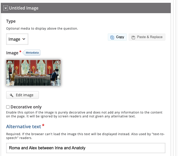
For example, adding alternative text to images will require a different process in each tool. Whereas in H5P the alternative text box appears automatically when you add an image to your lesson, in Genially you have to remember to click the “More” menu to open the interface that allows you to type in an alt text, and the process takes more clicks. This means that alternative text may be easier to overlook in the Genially tool.
|
|
|
Takeaway 2: Accessibility statements: being honest about inaccessibility is a form of accessibility
Susi Miller recommends including accessibility statements with all learning materials, since transparency can help users better navigate the content while also reassuring learners with access needs that the creators are committed to improving accessibility, since as technology changes, there may be ways to address what was once not accessible. According to Miller, accessibility statements should include:
- An explanation of any parts of the content that are not fully accessible, along with the reasons why.
- A description of any accessible alternatives that are available, when appropriate.
- Contact information or a form that allows users to report accessibility barriers or failures to meet accessibility requirements.
You can also find some tools to help you write an accessibility statement at the Web Accessibility Initiative or Accessible.org.
Takeaway 3: Accessible content begins with accessible authoring tools
Some accessibility standards are beyond the reach of content creators who do not have coding skills and instead depend on the software itself adhering to those standards. However, the more we understand about the accessibility conformance of the tools we use, the better equipped we are to choose accessible platforms, make informed decisions that support learners with access needs, and advocate for improvements with the companies that develop and maintain these tools.
Using H5P as an example: I have long been aware of its “Content Types Recommendations” page, which outlines the degree to which different activity types conform to accessibility standards, and I consult it regularly. Through reading Designing Accessible Learning Content, I also learned about Accessibility Conformance Reports (ACRs). When I searched for these on the H5P site, I found the H5P Group Accessibility Conformance Report from April 2026, which provides more detailed information about the platform’s compliance with accessibility standards. Although parts of the report were difficult for me to fully understand because they are written primarily for coders and developers, my understanding was greatly improved by the background knowledge I gained from Miller’s book.
Expanding our knowledge of accessibility can help us make better instructional decisions. A stronger understanding of accessibility principles can influence choices both large and small. For example, we can select a textbook that includes an accessible electronic version rather than one that cannot be used effectively with screen readers. Likewise, when deciding which authoring tool to adopt, accessibility features and standards compliance may become important factors that help tip the balance between competing options.
One example from my own practice involves H5P. In her book, Miller discusses the concept of “focus order,” which refers to the sequence in which assistive technologies navigate content. Because I sometimes use H5P’s “Course Presentation” activity type, an interactive slideshow tool, I became curious about how focus order functions within it. After searching the H5P forums, I learned that the tool currently does not allow designers to manually adjust focus order. Instead, the sequence follows the order in which elements were added to the page, which is not always the most logical experience for users relying on assistive technology.
Knowing this will change the way I design materials. When creating a “Course Presentation,” I will now be more intentional about building slides in the correct sequence so that the focus order remains logical. In some situations, I may instead choose H5P activity types that handle focus order more effectively, such as “Interactive Book.” At the same time, greater awareness of these issues also positions us to advocate for improvements, encouraging platforms like H5P to provide designers with more control over accessibility features such as focus order.
When selecting digital tools, we can also include accessibility as one of our evaluation criteria. Susi Miller identifies several minimum accessibility features that authoring tools should provide, including support for alternative text, captions, keyboard accessibility, and clear navigation. She also notes that template-based tools often conform more consistently to accessibility standards than open-control authoring tools. At the same time, the access to source code provided by open-control tools can allow users with coding skills to add accessibility features that may not otherwise be available, whereas some template-based tools do not make it possible to add in custom features.
Takeaway 4: Give alternatives
When it is not possible to make an activity fully accessible, we can provide meaningful alternatives. Susi Miller describes her approach this way: “I take a pragmatic approach by providing alternatives for non-accessible content and documenting tool limitations in an accessibility statement. This strategy is guided by my conviction that it is better to provide learners with alternatives than it is to strip out content and potentially harm the learning experience for everyone” (p. 49). She also notes that accessibility guidelines support this approach, giving the example that a transcript serves as an alternative to audio or video rather than an exact equivalent experience.
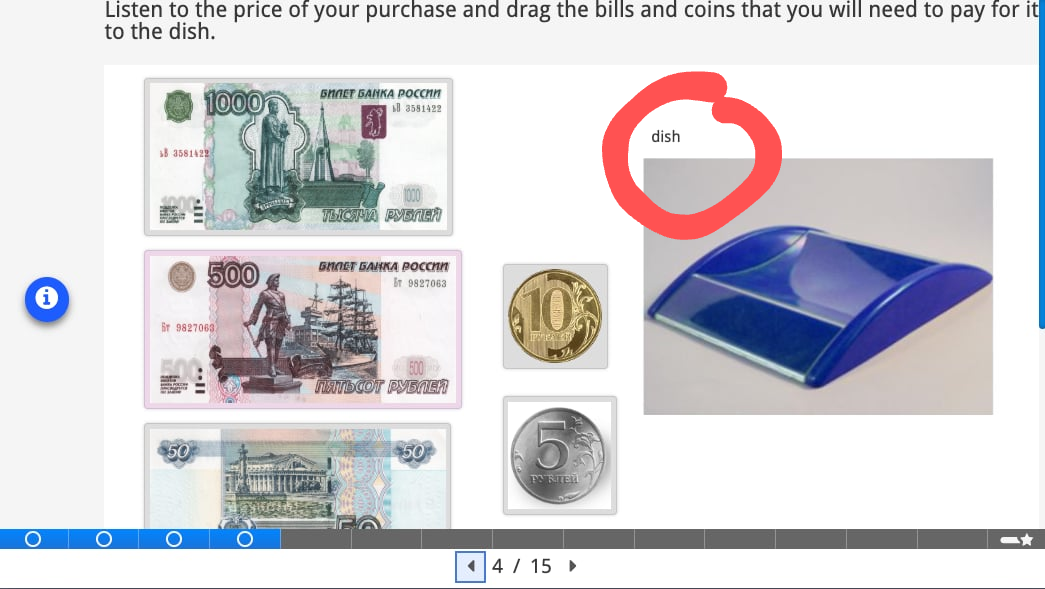
One example from my own teaching involves drag-and-drop activities. I often use these because their interactive, tactile nature can make tasks feel more realistic. In the activity shown below, students practice making purchases in Russia. During the lesson, they learn that Russian stores traditionally have a dish where customers place money, since cultural norms discourage handing money directly to a cashier. In the drag-and-drop version of the activity, students listen to a total amount and then drag the correct amount of money into the dish. The dragging motion mirrors the real-life action being described.
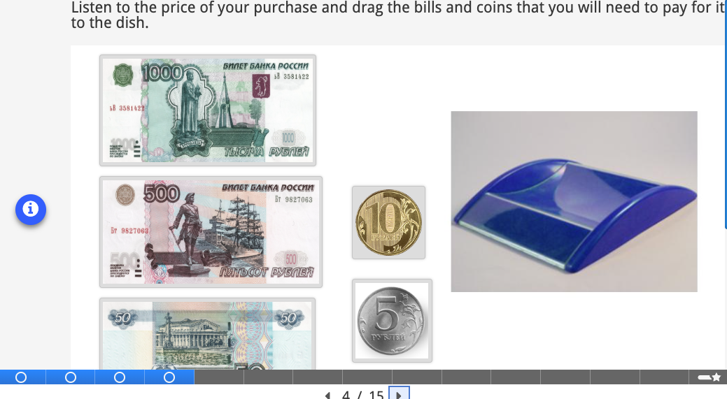
However, because these activities rely on mouse interaction, they can present accessibility challenges. One improvement is to add a clear label to the drop zone so that assistive technologies can identify it.
To ensure that all learners can participate comparably, we can also provide an alternative version of the task. For example, H5P allows content to be presented using buttons, so a parallel multiple-choice version of the same activity can be included on the page without requiring drag-and-drop interaction.
Takeaway 5: The basics and beyond: (relatively) simple steps that you can take now to improve accessibility in your course materials
You may already be familiar with some of these key accessibility features. In the spirit of “progress over perfection,” I am including a few additional practices that you may not have considered (I did not know them all, either!). Choose a few to implement soon, and place others on your longer-term list. I will be doing the same.
Alternative Text
One of the most important steps you can take to improve accessibility is to include alternative text for images. When writing alt text, consider the function of the image on the page and communicate that purpose clearly and concisely. You can find some guidelines about writing good alt text at this page from Perkins School for the Blind.
Captions and Transcripts
Accessibility standards say that ideally, we should provide both captions and transcripts for all audio and video content. Tools such as Turboscribe can help immensely with the creation of these resources.
A more difficult question for language teachers arises when accessibility standards appear to be in tension with sound pedagogical practice. Certainly, we should provide alternatives for learners with hearing impairments. However, if listening comprehension is the primary goal of an activity, does providing a transcript or captions undermine that goal?
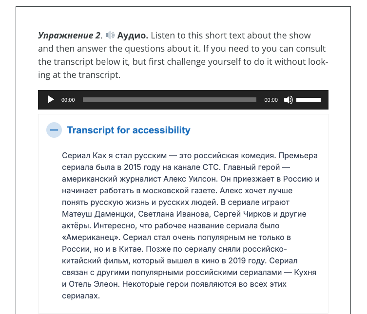
In my own practice, I have adopted a compromise. After audio or video content, I place the transcript inside H5P’s “Accordion” activity type, which allows text to remain hidden until the learner chooses to reveal it. In this way, the transcript is available to those who need it, but it is not immediately visible to everyone. I also sometimes include a brief note encouraging students to challenge themselves to complete the activity without the transcript first and then use it as a support if needed. This approach attempts to balance accessibility with the pedagogical goals of the task.
|
|
|
Set the Language
For language teachers, setting the document or interface language is especially important so that screen readers pronounce the target language correctly. Unfortunately, not all tools make this easy, particularly when materials include multiple languages. The University of Washington’s Digital Accessibility Checklist offers guidance for setting the language in common formats, though you may need to research how to do this in the specific tools you use. If a platform does not support language setting, consider advocating for this feature with the developer.
Color Contrast, Do Not Use Color Alone
Because users perceive color differently, ensure strong color contrast between text and background. For standard-sized text (17 pt or smaller), contrast should be at least 4.5:1. For larger text (18 pt or larger), the minimum contrast is 3:1. Online tools such as the WebAIM Color Contrast Checker can help verify compliance.
Do not rely on color alone to convey meaning. If you use color to indicate correct or incorrect answers, include text labels or icons as well. Similarly, when using color to distinguish elements in a graph, add patterns or other visual cues.
Block Text Width
Miller recommends limiting blocks of text to a maximum width of 80 characters to improve readability. Although the book generally does not focus on other languages, she notes that for Chinese, Japanese, and Korean texts, the recommended maximum width is 40 characters per line.
Give Users Control Over Time, Volume, Background Sound, Motion, Play
Whenever possible, allow users control over how they engage with materials. Avoid strict time limits, or provide options to extend them. Enable users to adjust volume or background audio. Unless essential to the content, avoid automatic movement or autoplaying media; instead, let users initiate these elements themselves.
Use Inclusive Language
Not all users will interact with materials the same way, so use more inclusive phrasing, such as “Select” instead of “Click,” or “Enter your answer” instead of “Type your answer.”
Make Headings, Buttons, and Links Meaningful and Predictable
Ensure that headings, buttons, and links clearly describe their function. Users should be able to anticipate what will happen when they activate them. For example, if a link opens in a new tab or window, indicate that in the text. Or instead of link text that repeatedly says “Click here,” give meaningful descriptions of what the links will lead to.
Make Navigation and Links Consistent
To reduce cognitive load and improve usability, keep navigation elements in the same order across your materials. When multiple links point to the same resource, use consistent link text. For example, if there is a reference link like a glossary that appears more than once in your materials, be consistent about what words you use to point to that resource so that it is easily identifiable, and users don’t mistakenly believe that the links point to different resources.
Conclusion
Improving accessibility is vital for users with visual, hearing, motor, cognitive, or speech disabilities, but these improvements can also benefit all learners. Transcripts allow anyone to search for specific phrases in a video; alt text supports users with slow or limited internet connections; consistent navigation reduces cognitive load for everyone. Accessibility also supports individuals with temporary or situational needs, such as recovery from injury or challenging environments.
With WCAG Level AA accessibility standards becoming increasingly important in institutional contexts, compliance is a practical necessity. But beyond compliance, as Designing Accessible Learning Content emphasizes, accessibility is fundamentally about inclusion. It is simply the right thing to do.
By reading this “5 Takeaways” article, you have already taken a meaningful step toward progress over perfection.
References
Miller, S. (2025). Designing accessible learning content: A practical guide to applying best-practice accessibility standards to L&D resources. Kogan Page Publishers.
AI disclosure: AI was used to polish wording.
This is a very helpful article, thank you! I had no idea about the focus order issue with H5P.
Yeah! I feel like I’m pretty chaotic in what order I add elements to the page, so I’ll have to think a lot harder or maybe do some more storyboarding to improve this. Or maybe I’ll just make a slide and then when I think it’s finalized, I’ll make a new slide and copy and paste stuff on the new slide in the right order. It would be better if we could adjust the order though!
I LOVE this new article format and I am looking forward to reading this book now. I think it could be very helpful in my journey toward creating more accessible course content. Thank you, Shannon!
You’re welcome! Thanks for the comment!